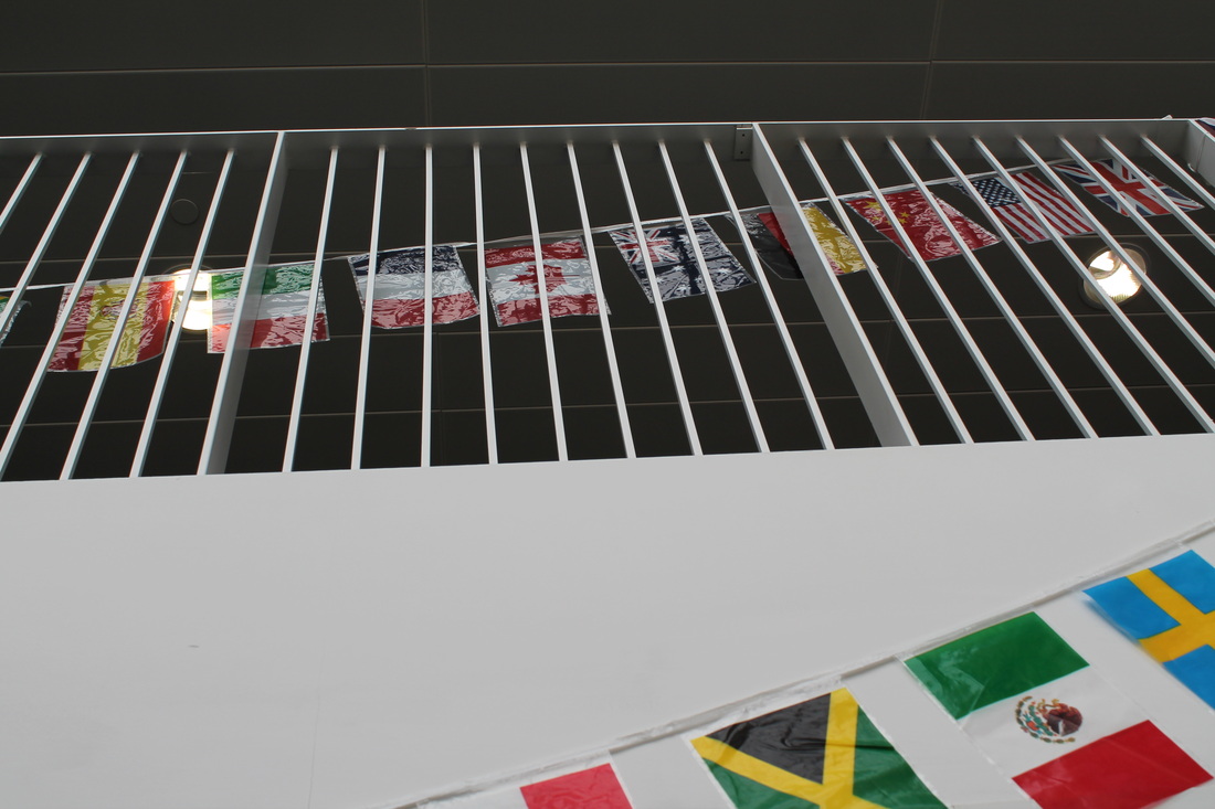
|
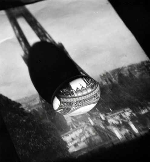
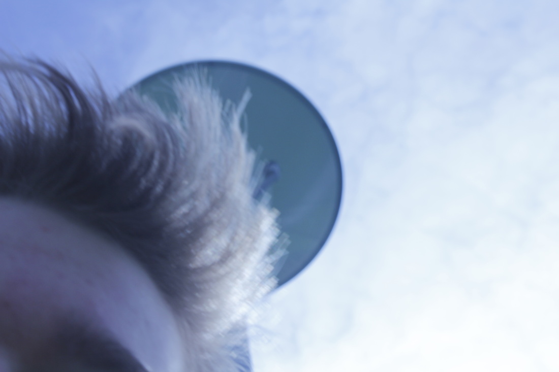
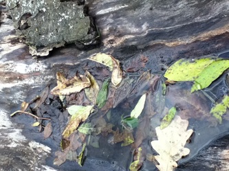
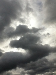
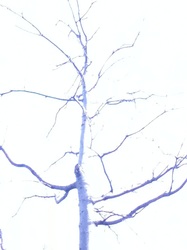
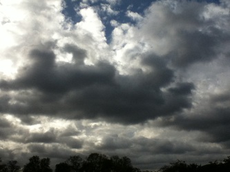
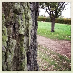
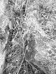
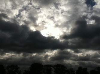
Introduction to abstractionTo start our abstraction page we were given this picture to look at and inspect, we had some time to discuss its meaning and what it exactly was. This picture is a good example of abstraction, a abstraction is basically where accurate focusing and other values hold no value. Its more about creating pieces of work where the from is more important than whats actually in the picture. We had to create 5 questions in relation to the image then form a pyramid out of them to show the importance of each question in our eyes.
5 Question:(not in order) 1.why did the photographer decide to take the picture in black and white? 2.what is it's purpose? 3.what effect is it meant to have on the person looking at it? 4.where was the image taken? 5.who is the photographer? 6.what's the story behind it? |
Question pyramid We were given the task to create a pyramid out of our pictures, in the order of importance. On the bottom of the pyramid we put what's the story behind it, where was the image taken, what is it's purpose. Then on the next level of the pyramid we put who is the photographer and why did the photographer decide to take the picture in black and white. Finally we put what effect is it meant to have on the person looking at it, this was due to the fact that we felt the effect on the image is vital to constructing a important image.
|
|
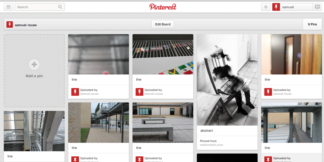
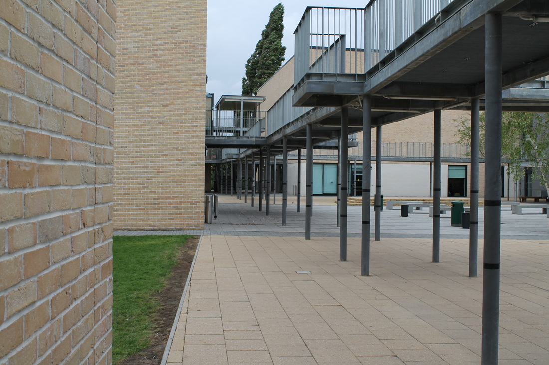
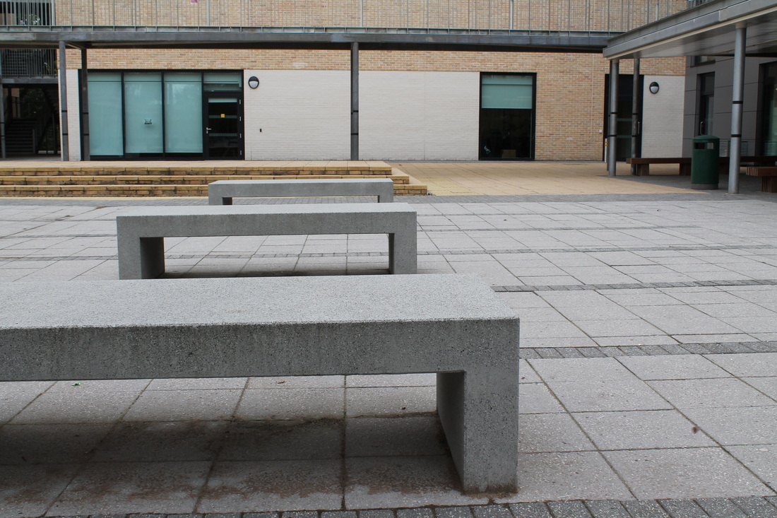
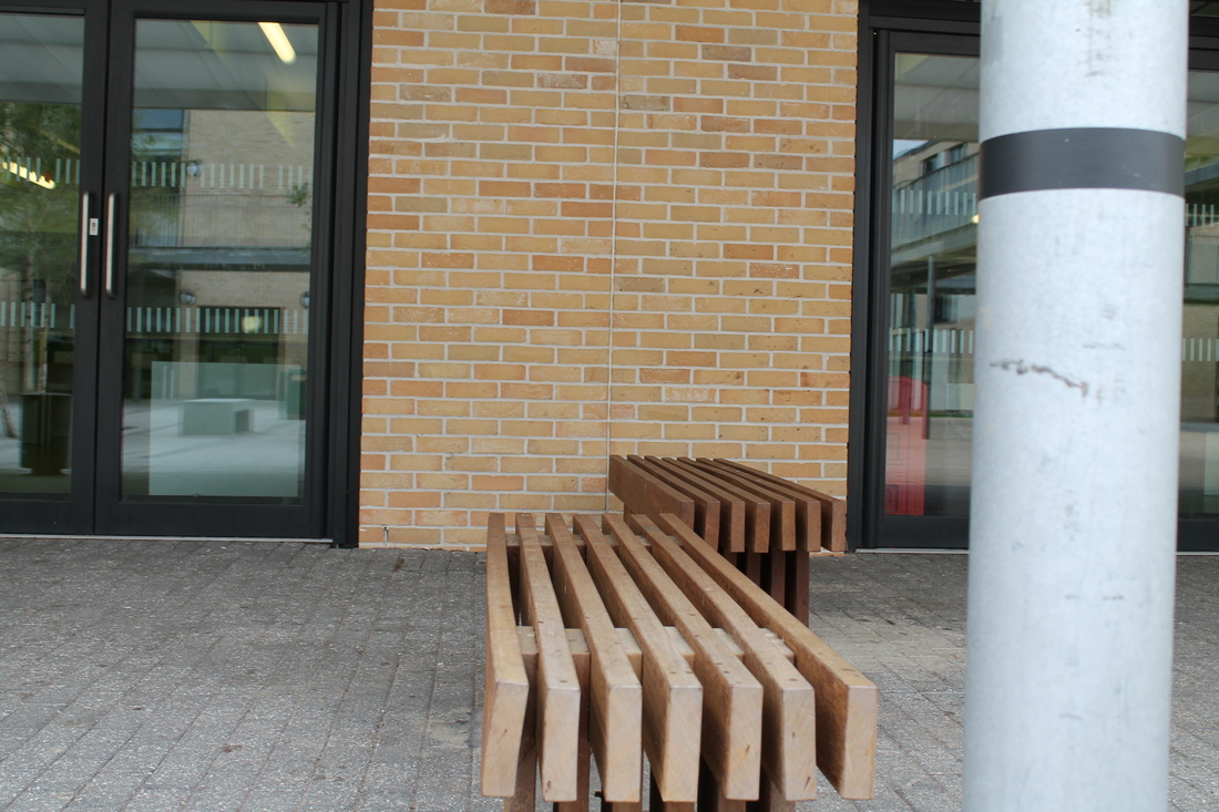
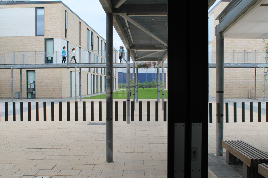
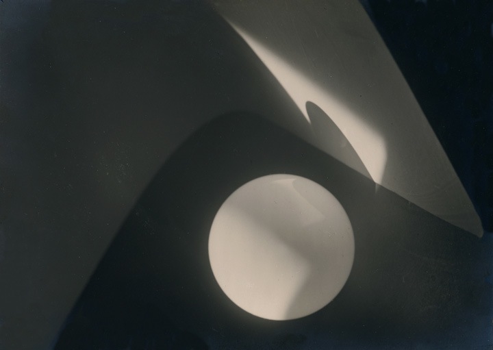
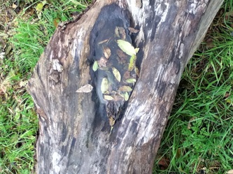
Abstract photography board
Formal elementsPhotographers will often find ways to create a much deeper form of interest in the photos which goes is deeper than just the subject which the photo is usually based upon. These are often called the formal subjects, they are the parts of the photo which are not based on the subject.
These forms are: 1.)Focus 2.)Light 3.)line 4.)shape 5.)space 6.)repetition 7.)texture 8.)value/tone |
|
Describing the formal elements
Focus: The areas of the photo which appear clearest or sharpest or the areas which are not.
Light: Which part of the photo is the brightest which isn't, are there any shadows in the picture. Can you guess the time of day just be looking at the photo or is it obscured in some way, directed or reflected?
Line: Are there any objects in there which represent lines or show lines? What is there shape of the lines: wide, thin, curvy, straight, split? Is there a general direction created with the photography, is there any energy being show with them?
Repetition: Do any of the objects lines or shapes which repeat to create a pattern?
Shape: Is there any geometric patterns which show up on the photo, or are there any organic shape, where are they?
Space: Is there depth to the photo or is it shallow. What is there that makes the photo appear like this? Is the depth created by illusion , does the positive and negative create different depths.
Texture: If you could touch the surface of the photograph would it have a feel, if it did what would it feel like?
Value/tone: Does the picture show a range of tone from dark to light. Darkest? Lightest?
|
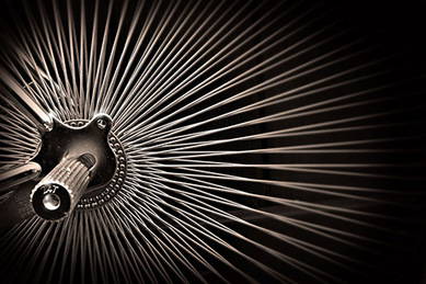
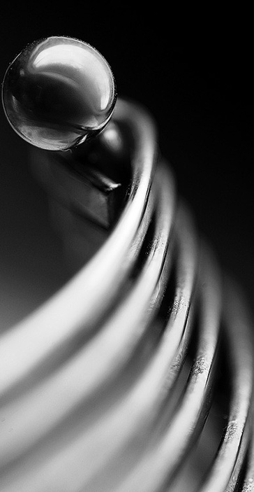
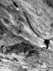
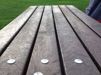
Formal elementsThis is a piece by Sienna Skelton that I found on pinterest while looking for interesting examples of abstractions in photography, I'm going to review how the formal elements are presented in the picture.
Focus: The ball of the metallic object is in very clear focus as well as the middle of each metal line. However ether side of the metal line is very unfocused as well as the background. This gives it a abstract look as your eyes are drawn to the focus parts were you then notice the strange contrast in the picture Light: The light in this photo looks quite directed which gives a appealing shine to the metallic object, the front of the photo appears very bright where it slowly fades to a darker background, it has a very cold feel Line: The lines in this photo which stand out to me are the lines of negative which which hit the same spot on each metal tube Shape: A spherical metal object is near the top of the photo, it creates a abstract look as any light reflected of the ball creates a strange look. The negative and positive light really contrast on the ball's surface to create a moon shape. The lines bend round and have quite a geometric space between and the way hey bend also looks quite geometric Repetition: The light hits the same place on the bar each time which creates a repetitive sequence, this fades off the screen, this segment on the bar also happens to be wear it is very focused. It created a ladder leading up to the ball. Texture: It has a very cold texture you can tell it's some sort of metallic material and it gives of that look of something which is very cold and hard. The doesn't seem to be a lot of textures with this piece except for smooth cold and hard. Tone: It's only colour's are tones between white to black which is effective as this creates very significant contrasts between the objects, which also helps bring the cold feeling to the mind which is useful as it brings effect to the picture. |
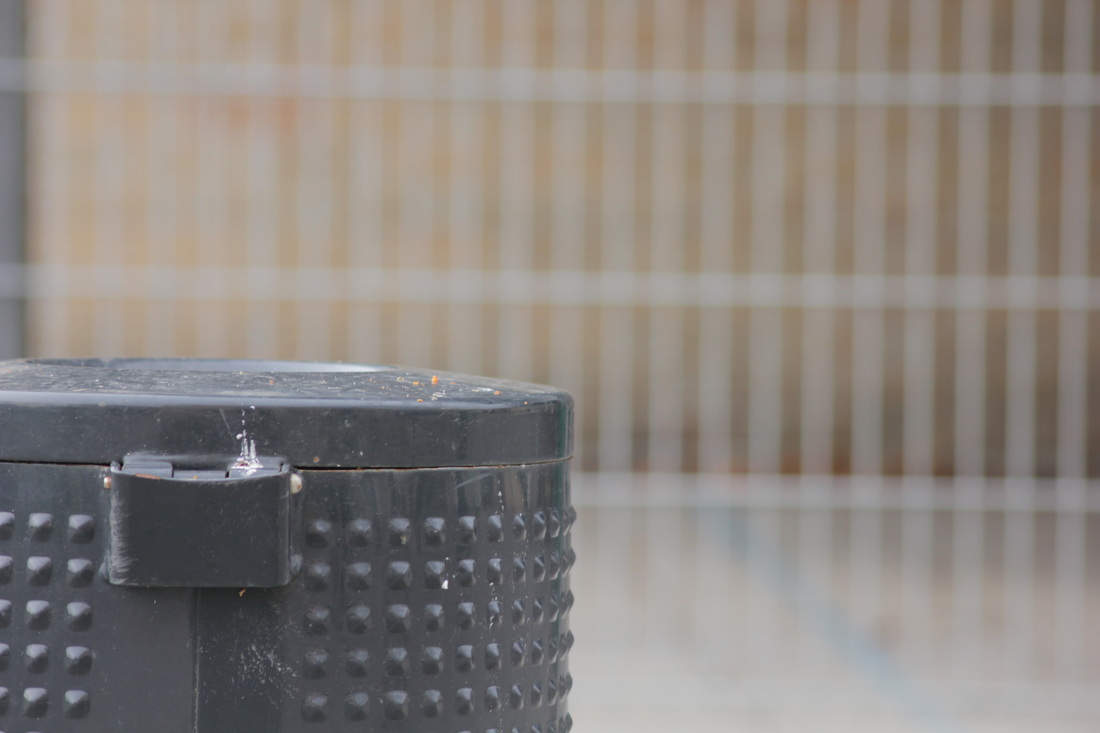
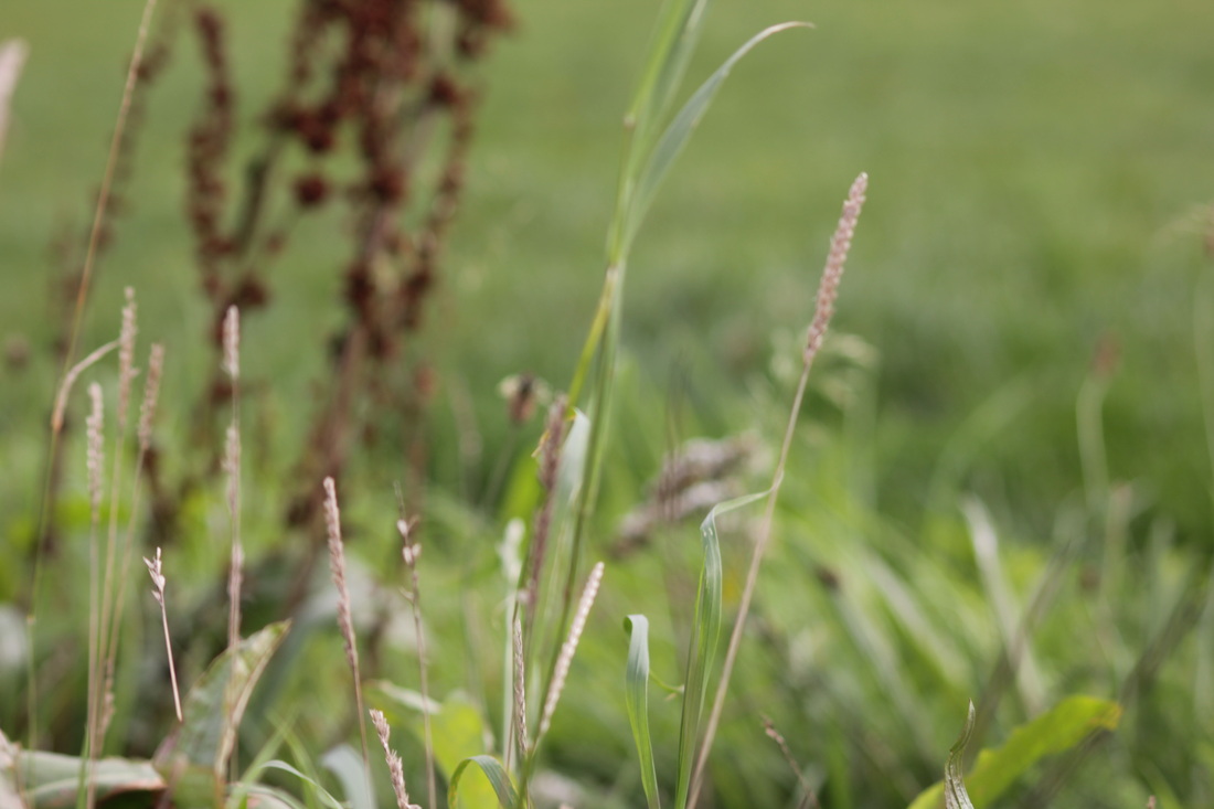
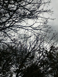
Photo series 1# Line |
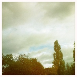
Photo series 2# Light |
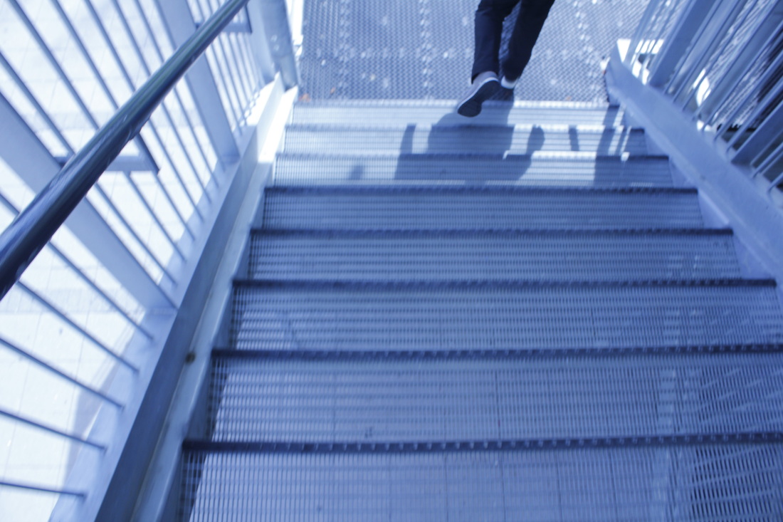
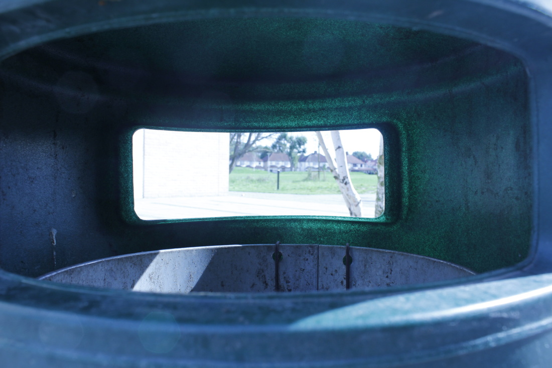
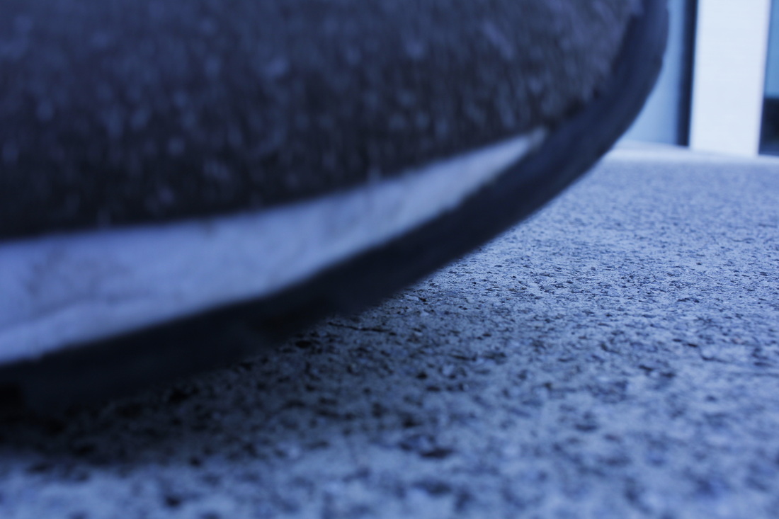
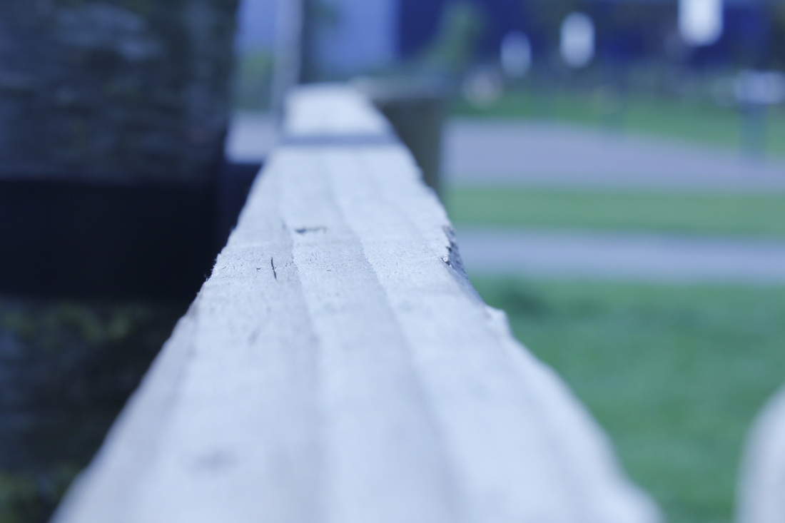
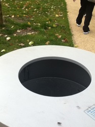
This were my two collections of photos which I created in class the first using line for its formal elements as the pictures had to based upon them, my second using light as the formal experiment. I preferred the second one to the first because I felt more comfortable creating images focused on a specific formal element by this point, also the photos had much better effect. My favourite picture was the one to the side of the bin were the light was clipping the top of this. It's hard to tell what it is which i thought made it really abstract, also the way the light has hit it it makes the a really clear contrast which also gives it this geometric look. Also the background is out of focus where as closer is very clear. Although I am quite happy with the outcome of these two series of photos I think that for my next set of pictures I would be more adventurous and create a series combining two or more aspects or take the pictures and put them in photoshop for editing.
Chemigram experimentsChemigram is a process which light sensitive paper is exposed to a mixture of chemicals: developer, fixing and stop. After this they are left in sunlight and can be affected by a range of variables including humidity, this results in a interesting image. Also they're never the same which leads to really abstract images. Its linked to abstract photography so we did some of our own, to give it its own touch we played round with them in photo shop
|
|
Mind map
|
|
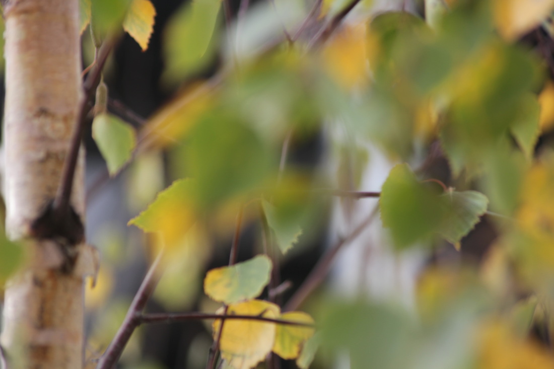
I used popplet to create my mind as i find it works quite well in showing your ideas as well as making some links between the points. I started just by listing some processes and formal elements then from there i could be more creative. For example my light linked onto shadows and my focus linked to the blurred effect which i'm am going to make a set of photos focused round. I like using popplet as it shows the thought process really well and any additional thoughts I have I can add to it.
|
Set 1: Shadows
Jaromir FunkeHe was a Modernist Photographer during his time as a photographer he first experimented with constructivism, surrealism, poeticism & expressionism as a amateur. However it was his later works which where more famous and remembered, like becoming one of people to create the czech photography society.
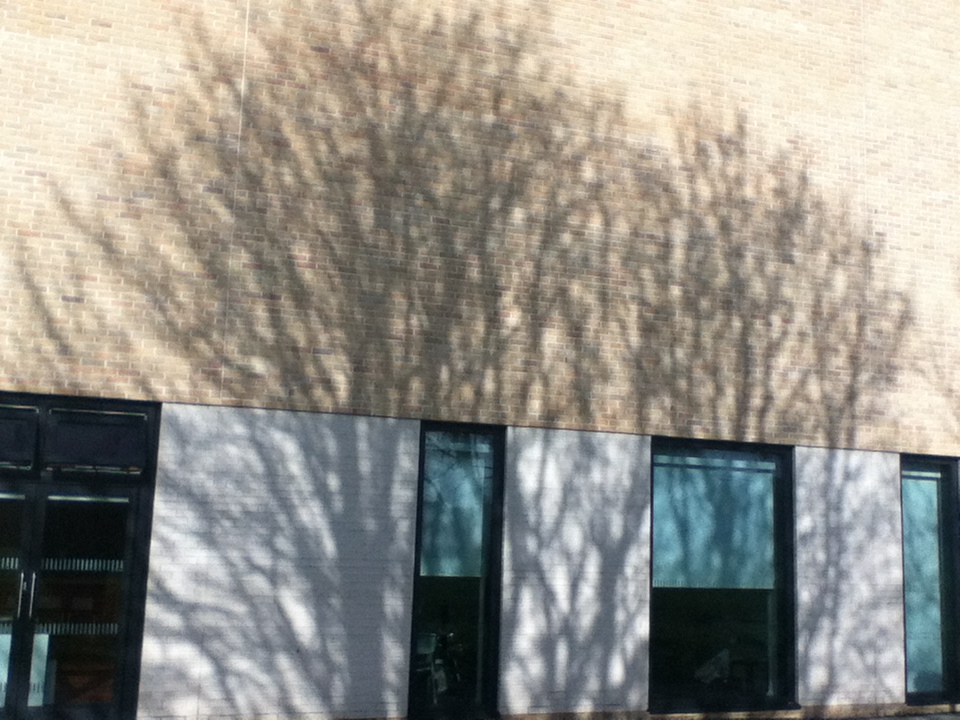
The reason I have studied him is because lots of his pieces involve shadows, I want to be using shadows in one of my sets as well as incorporating them in my final piece. His pieces gave me some really interesting ideas for how I could present the shadows in my images and the ways which I could obtain the images. 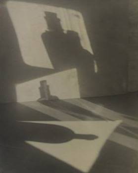
|
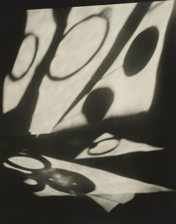
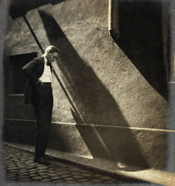
The image to the left is a piece from Jaromir Funke and I really like the photo, firstly the shape in which the light is must have been from some shape or window which has left the left clearly separated. They also look very geometric and they are in a very clear shape, this makes very clear strong contrasts also the unknown figures which appear in the shapes of light make you want to see more and it looks very eerie.
|
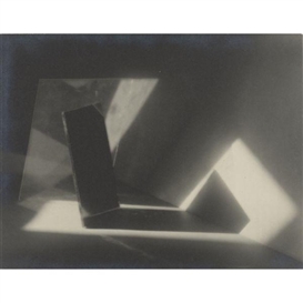
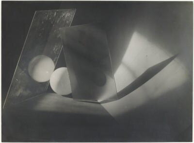
Jaromir Funke work
Ralph eugene meatyard
|
He was a American photographer from Normal, Illinois, he first began to photograph in the early 50's with pictures of his son, later in his life he became part of the photographic society of America. During his life he had a strong interest in jazz and lots of his work happened to be influenced by it.
It seems like a lot of his photos seem to consist of strange figures wearing masks however these aren't the ones which interested me the ones which interested me were hid ones of nature. The have distinctive look firstly they look quite abstract as they mostly in black and white. This gives it quite a cold empty look to the picture, also the focus alway seems to be distorted in some way which makes them strange to look at. |
Targets
1.) I am interested in creating a series of photos revolving mainly around shadows and having playing around with focus and how much focus is distorted.
2.) During my work i have been researching the work of Jaromir Funke who did lots of work with shadows also known for using props such as lights and mirrors as well as numerous insignificant objects.
3.) Over the cause of half term I hope to firstly greatly refine my site, in terms of project I want to create a set on focus and a set on shadows. I would also like to create some images which incorporate them in a innovative way which i can then refine and apply to photoshop.
Set: Focus
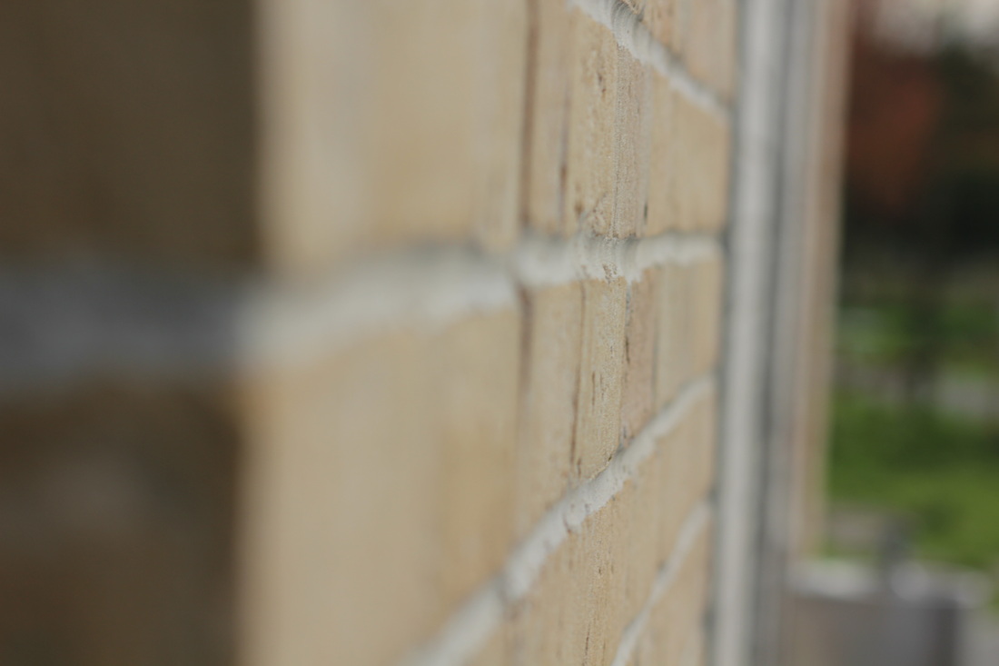
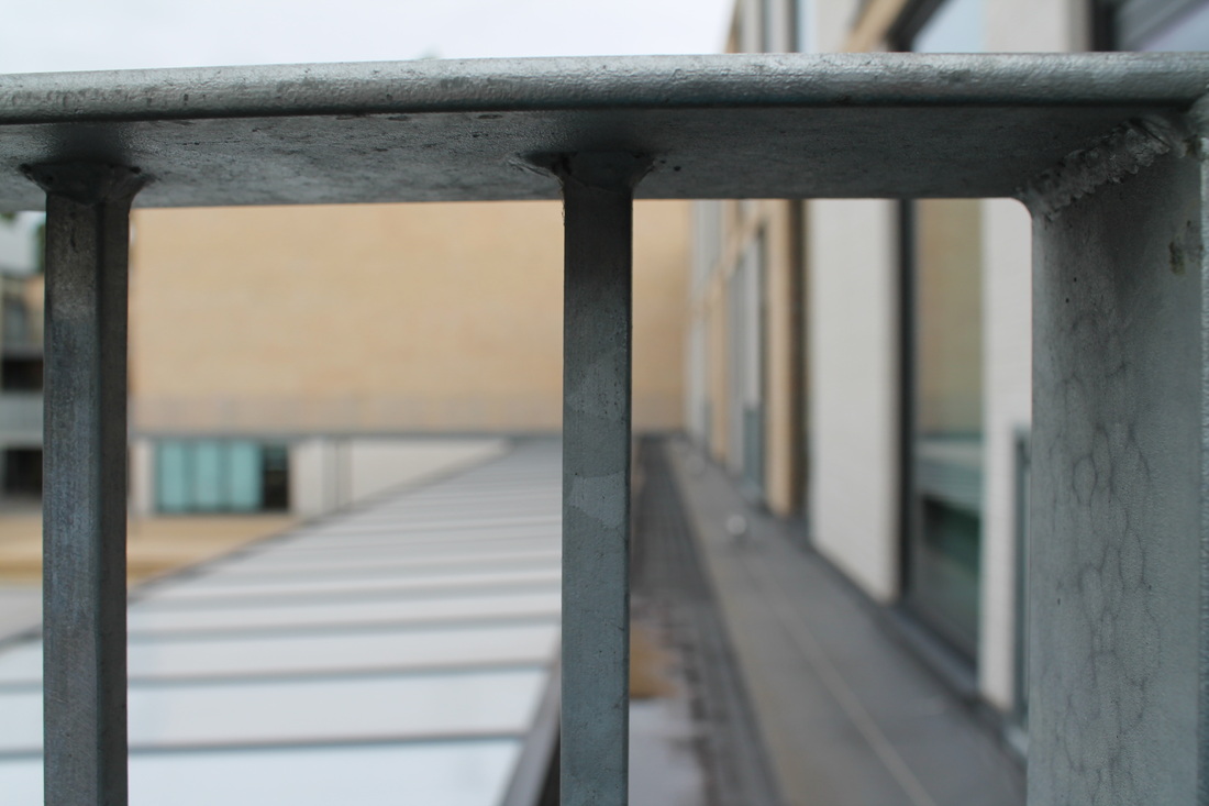
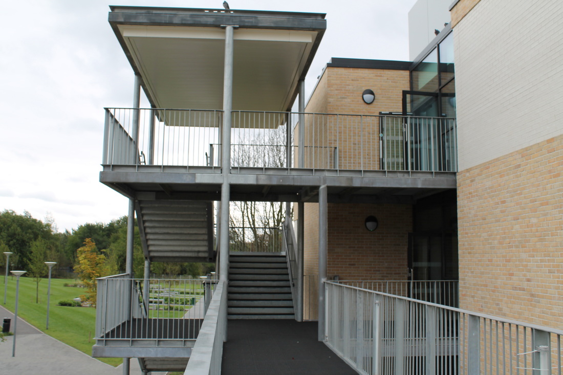
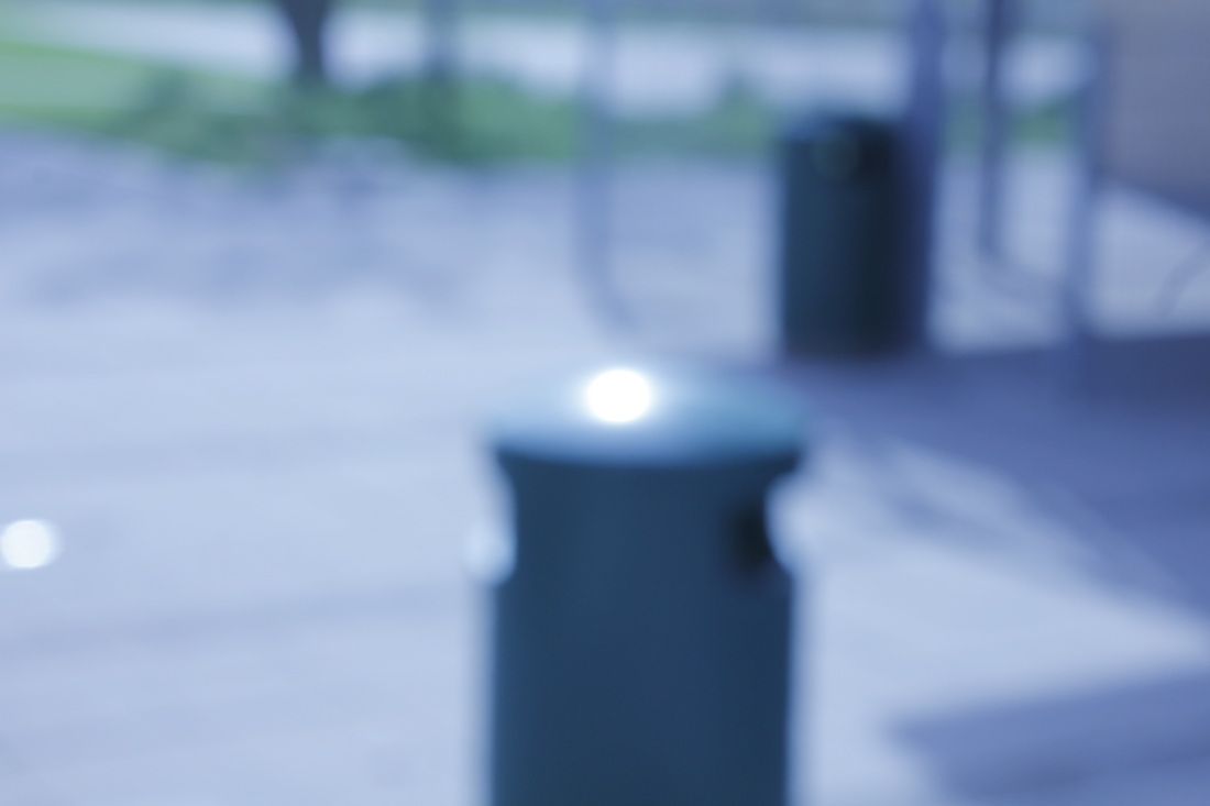
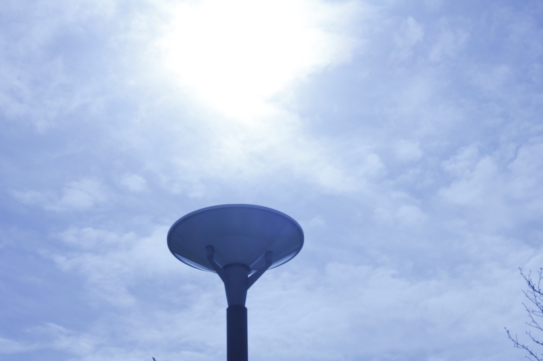
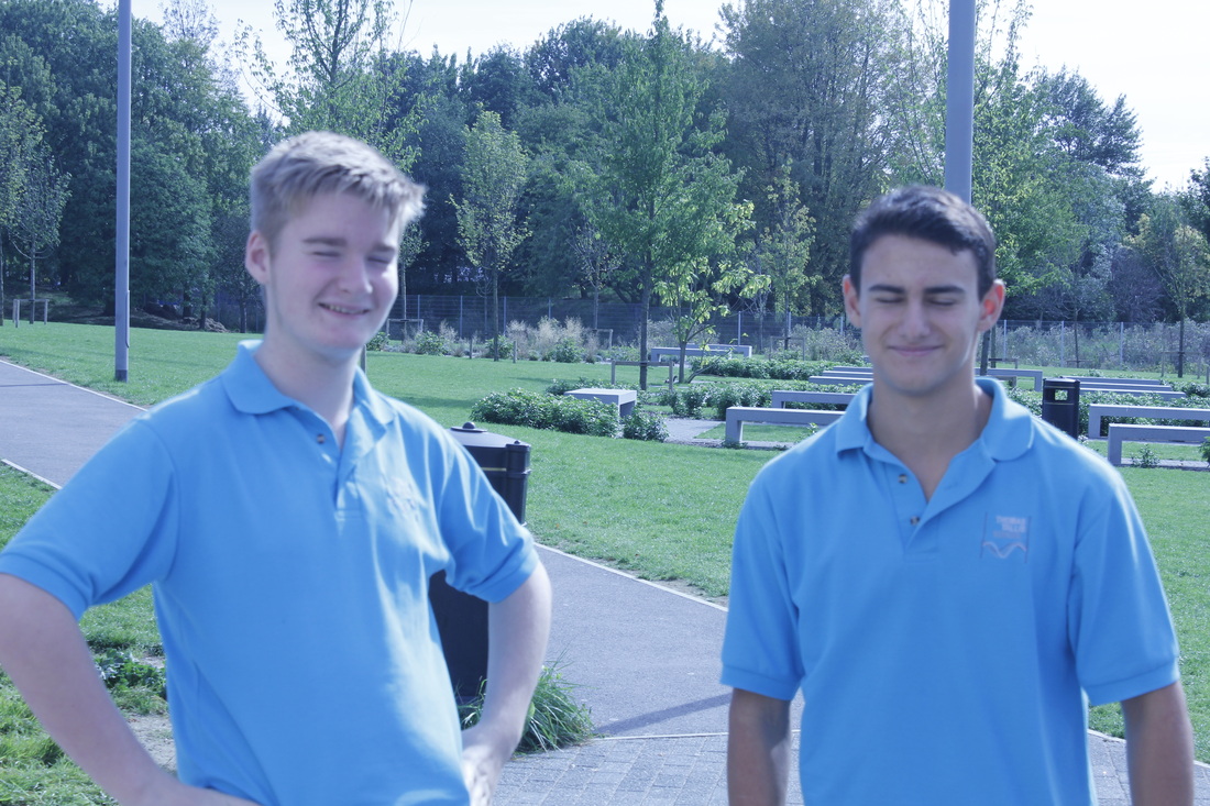
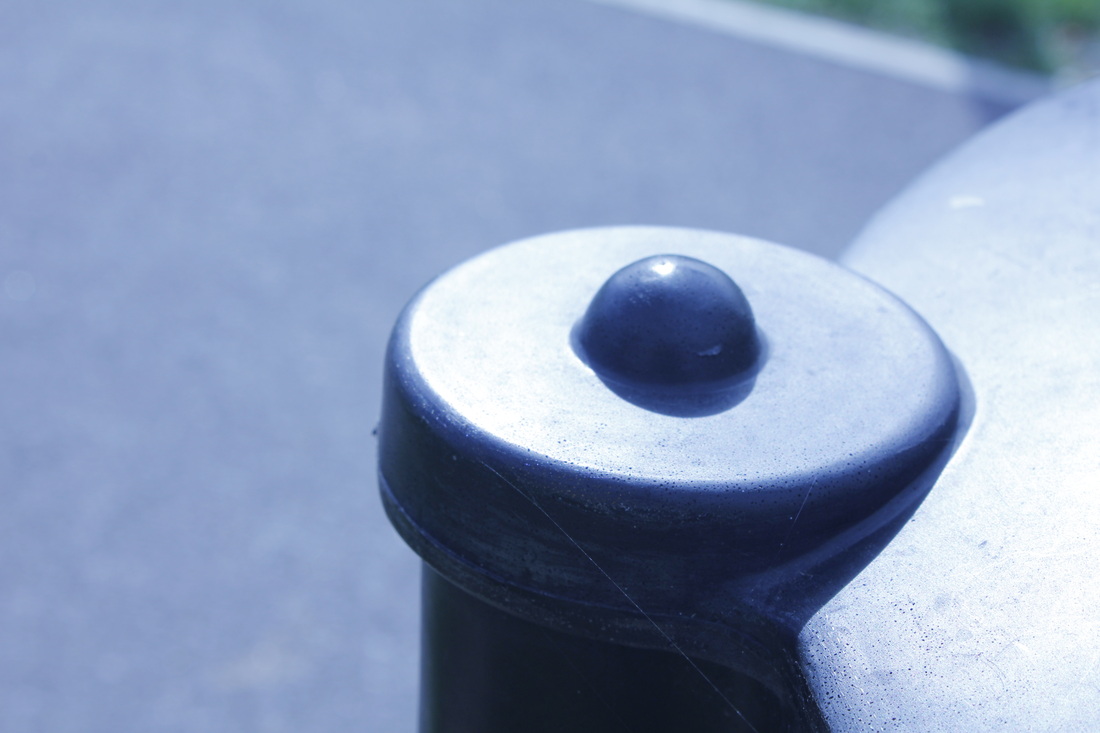
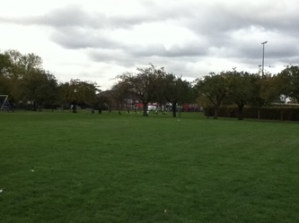
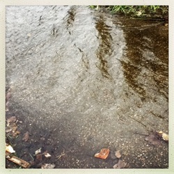
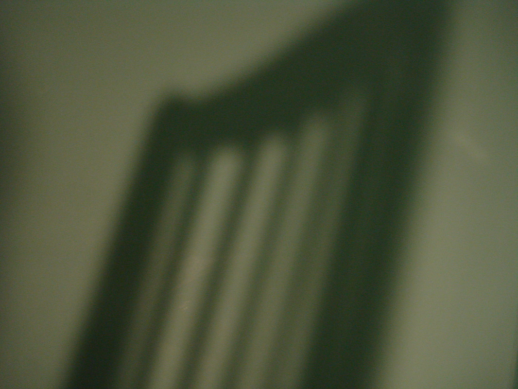
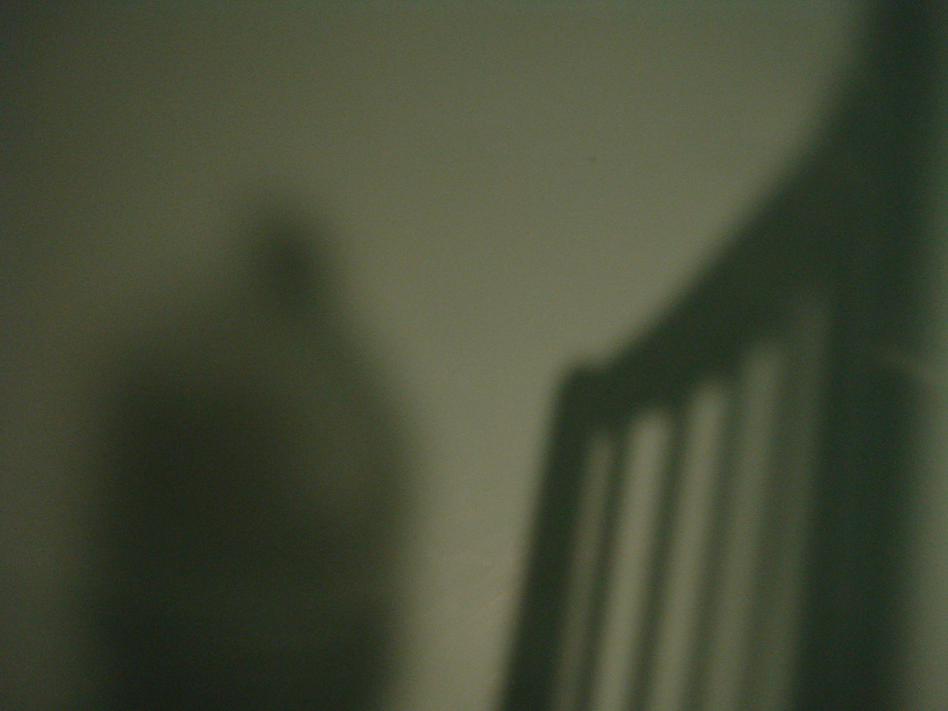
Sutcliffe park photos
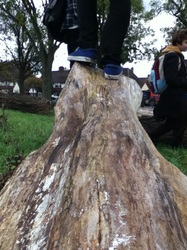

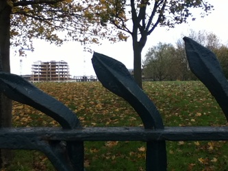

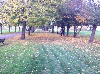


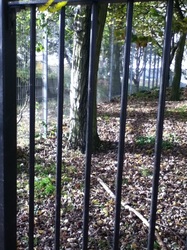
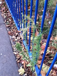
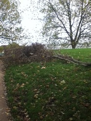
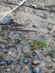

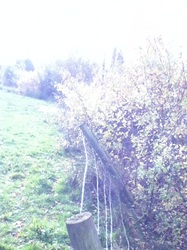

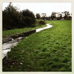
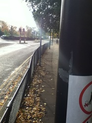
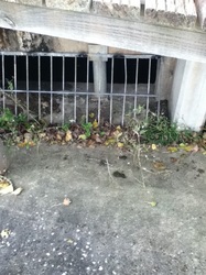


WWWI liked the fact that there was lots of filters used such as normal, black and white & hipstermatic, these were also mix with a range of shots such distance and focus so when i looked through the photo there was a lot of diversity between them. The majority of the pictures turned out really well and each picture was different, however my favourite one was the picture of the bent railings. The railings were very centred in the picture and it was a close up shot of the three railings, This picture was very effective as you could see the park and buildings of Kidbrooke in the background but the railings seemed to be almost blocking you out from it.
|
EBIAlthough I did like the majority of the pictures I thought there was filters where there didn't need to be any which ruined which would have been a nice photo. Also in the future ill will try and take more time setting up to get photos which look clearer and be more effective. Another point which I could correct for any further photo series would be a better balance between the industrial side and the natural side so there is a grater contrast.
|
Sutcliffe triptych: 1


Sutcliffe triptych: 2

Final piece
IdeasI've decided that my final piece will consist of shadows because this is the area which I have found the most interesting throughout my studies of abstraction. I like using shadows to contrast with a strong light source, although they are quite a simple technique however they can create really powerful images. I'm interested in creating man made shadows rather than images in nature as natural images i believe look more effective. Also I been looking at the two photographers Jaromir Funke and Ralph Eugene Meatyard, personally i preferred the work of Jaromir Funke and his shadows are man made which gives a more abstract look. This is what inspired me to create my final piece about shadows
|
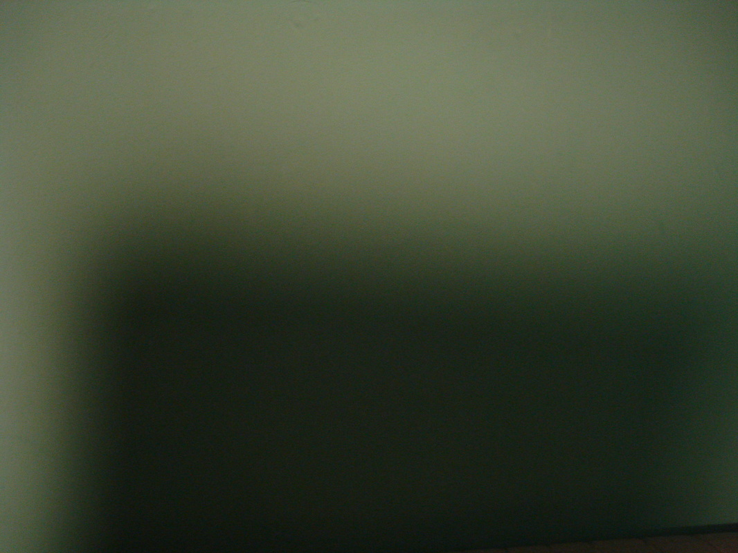
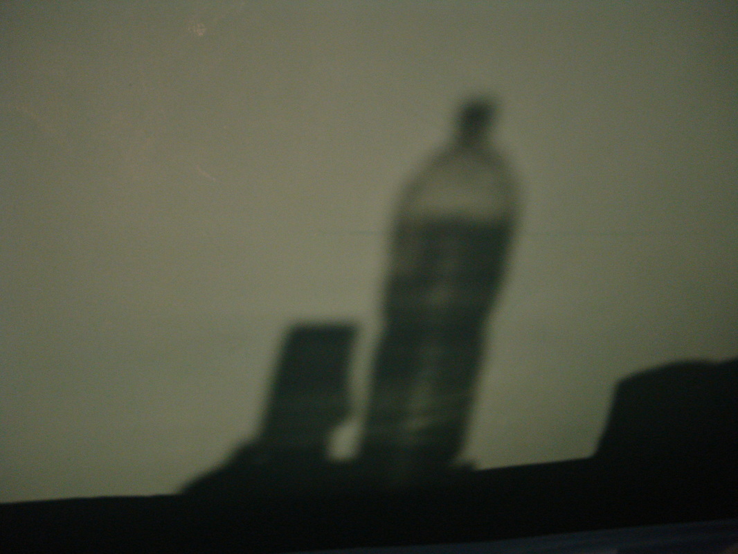
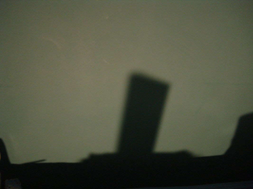
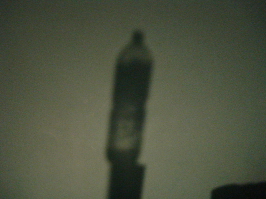
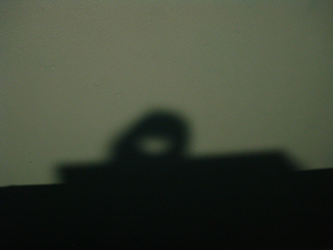
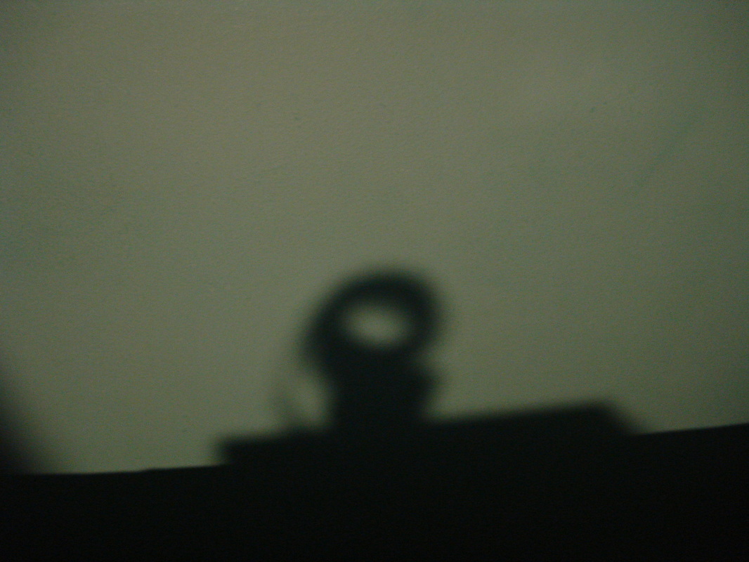
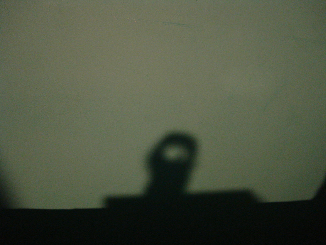
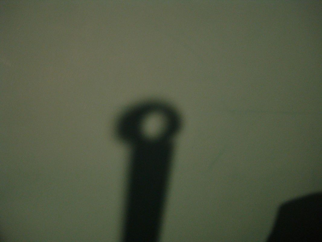
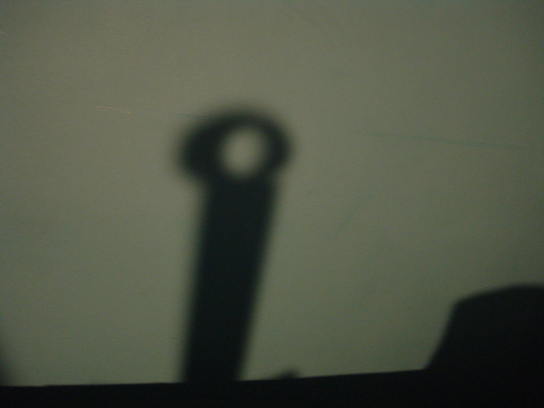
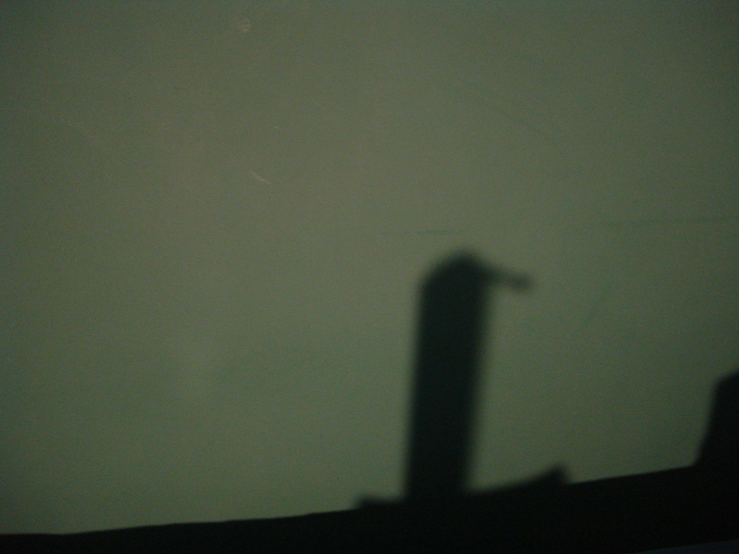
My first tryI wasn't planning to use these photos for my final piece they were more of a test run to see how it looked. They went quite well, I did them just to be safe and make sure this is actually what I want to do for my final piece When we created them we did not have a specific idea at first we just created it as we went along, firstly we got a large box full of miscellaneous objects. Then we chose various objects from the box and had them hung up on a string so there was a better shadow produced on the wall. Once it was hung up we could add or take away objects and try different angles, from this experiment I could see WWW and EBI. The actual idea went very well and I'm going to recreate it at home although instead of just throwing on any object I'm going to try and structure them so they make specific projections.
|
Images for the final piece
Final piece
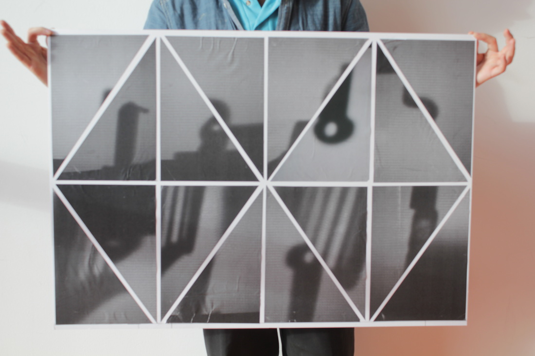
WWWThe editing of the photos was really beneficial because it gave a similar affect which Jaromir Funke has in his pictures. Also the black and white looks better with shadows because it looks more abstract. The end result of the shape was not really something I planned on once I had my 20 something right angle triangles I experimented to create a shape. The final shape I really liked because it has a geometrical pattern to it which is very eye catching.
|
EBIIt could have been measured a little better because some of the lines are slightly off which makes it seem messy and it loses its feel. Also I rushed when it came to sticking the triangles down which made small air bubbles and creasing. This made it looked rushed and I felt like it drew attention away from the piece. If I took a little more time it could have been really good, in the future I will make sure there is as much time spend on the making of the pictures as there are presenting the pictures.
|
