Cyanotypes
|
Cyanotypes are a type of photographic printing technique which gives an outcome in a blue-cyan colour on photographic paper. It is very effective as it does not need a camera and the process is very simple. The images which it produces are very interesting. The procedure is that you cover the paper in an iron solution and let ultra violet (sun's rays) produce an image. This leads to the distinctive negative image which cyanotypes have. The low price of cyanotypes means that mass copies of artists work can be produced.
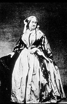
Two main chemicals used in the cyanotype process are: -Ammonium Iron(III) citrate -Potassium ferricyanide The process was discovered in the 19th century by the English scientist Sir John Herschel. However it was Anna Atkins who brought it the photographic world and as a botanist she is particularly know for her works of cyanotypes in nature. |
|
|
Anna AtkinsShe was an English photographer and botanist primarily known for making cyanotypes famous and for being one of the first female photographers. Her photography book has become famous as they show her works of cyanotypes. The full name of the book is Photographs of British Algae: cyanotype impressions which show a variety of botany such as seaweed, algae and other plants of a similar nature.
I really like her works of cyanotypes although they're quite old and they have an abstract look to them due to the colour which is almost of a neon consistency. Although the images are over 100 years old they do not look that old. Also she worked with plants where different parts of the plant had different thickness so there is a variety of opaqueness to the white colour of the objects. |
Anna Atkins work |
My favourite image would have to be this one
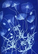
I really like this image: the deep tone of blue on the background which has a stronger contrast with the white unlike the lighter tone of blue. The petals have a good effect as they are not as thick as the other parts of the plant so their colour appears to be a translucent white which has almost faded into the background. This picture is very eye catching due to the blend of thickness. The opaqueness of the objects seems to become less and less as you move up the picture.
|
Cyanotypes 1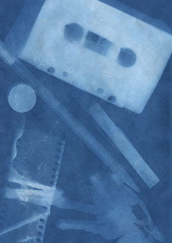
WWW
Some of the objects in the picture I tried to move slightly while projecting the light so some objects have been duplicated which gives a variety to the tone of the picture. This also means the objects are harder to distinguish what they are which adds interest to the picture. EBI There was not a sufficient amount of exposure to the picture therefore the majority of the picture is too faint to see. It is okay if there are hard and soft tones but the majority are faint tones which ruins the picture. Also this lack of exposure and me moving the objects which worked well at the start was overused resulting in the pictures looking very blurred. |
Cyanotypes 2
WWW
One of the objects have a duplicated effect which creates a range and fills up the picture thus giving it different tones. EBI This image was definitely the worst out of the two. I do not have much to say about it being good. The image is extremely blurred so it is hard to think of what went well when you see it. Also the objects did not work well together; it was a mess. If I decided to reproduce this image I would make sure there was a sufficient amount of exposure for the pictures. |
